
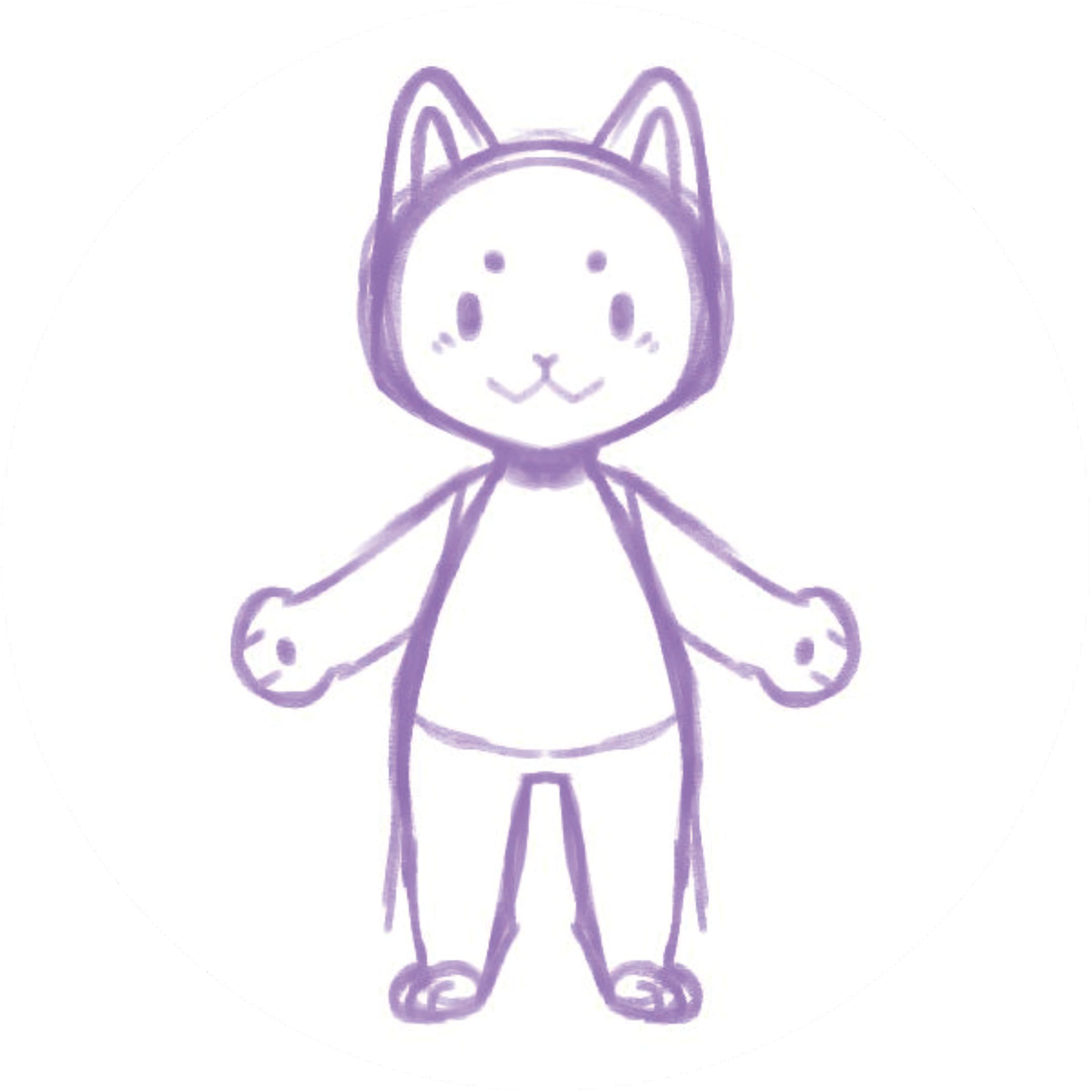
Look at your drawing at the size it will be displayed and check whether the character is easy to distinguish from its surroundings. Try changes to contrast or spacing on a copy.
Try this
If a blue character blends into a blue sky, try a lighter background or an outline and compare the results. Keep the original artwork so the artist can choose the preferred version.
Take it further
Try the comparison on both a bright and a dim display if available. Do not depend on color alone when a label or important instruction needs to be understood.
